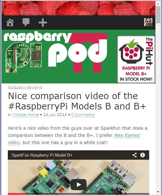
After a bit of messing around with different themes, Alex Eames suggested that I should make sure I hadn’t turned the responsive option off in the theme settings. It turns out it wasn’t that, but it did get me thinking… if the theme should be responsive, maybe I’ve done something to it. So, I switched back and forth and it reset the custom CSS I’d put in and, lo and behold, the site became responsive again. So, it was my fault entirely, which came as somewhat of a relief! So, I’ve re-applied my CSS changes, removed the offending lines and everything is now okay. So, thanks Alex for setting me on the road that took me to the answer! 🙂


[…] Michael Horne After a bit of messing around with different themes, Alex Eames suggested that I should make sure I […]
Looking good Mike!
Excellent upgrade to the blog. Much easier to read on mobile devices.
Oh, it’s a trend now, is it? Pfft
Ben
P.S. Hehe nice work
🙂